You may be thinking to yourself right now, “Wow, this site is amazing. It’s really one of the great blog designs of our time. Plus, how did he get these embedded videos to be responsive?”
First of all, thank you. That’s very flattering. Secondly, it’s actually a pretty simple little trick.
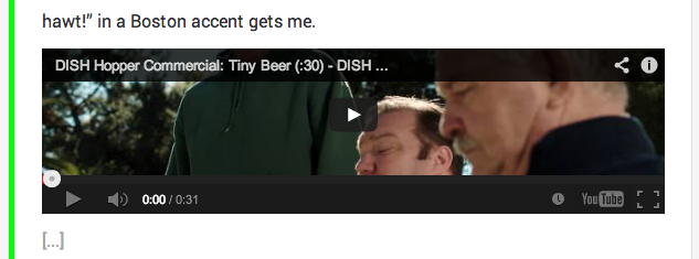
So you’re videos are popping out of the container on your beautiful responsive site and disappearing off the edge of the screen in mobile? Does it look something like this?
 It’s like the video has no respect for my carefully calculated padding.
Now, if this were just HTML5 video all we’d have to do is give our video a 100% width and an auto height, like so:
video {
  width: 100%    !important;
  height: auto   !important;
}
But it isn’t HTML5. If we try that on an iframe we get this smashed version.
The browser tries to render the iframe at a default height of 150px. That’s not going to work. We don’t want a squashed video.
Basically, what you’re doing is creating a 16:9 wrap to contain your video iframe. To do this you’ll need to create a container with a padding-bottom of 56.25% (16:9 ratio or 9/16). Here’s the code to use.
.video-container {
	position: relative;
	padding-bottom: 56.25%;
	padding-top: 30px;
	height: 0;
	overflow: hidden;
}
What that does is makes the wrapping box around our video have a bottom padding of 56.25% of our video width, which will be set to 100%. Then what we’re going to do next is give the embedded video within it an absolute position with a width of 100% and a height of 100%.
.video-container iframe,
.video-container object,
.video-container embed {
	position: absolute;
	top: 0;
	left: 0;
	width: 100%;
	height: 100%;
}
Now you should have responsive YouTube embeds in your site.
Of course if you’re trying to implement this into a WordPress install and don’t want to manually add the wrapping div around your embeds each time you can use this function.
function wrap_embed_with_div($html, $url, $attr) {

     return '<div class="video-container">' . $html . '</div>';

}

add_filter('embed_oembed_html', 'wrap_embed_with_div', 10, 3);
Now anytime you insert a YouTube video into your post it will automatically wrap it in your “video-container” class.
If you’re interested in learning how this works a bit more in depth check out the great article by Thierry Koblentz on A List Apart. He goes into detail on what each rule is doing.
These articles on Web Designers Wall and CSS Tricks were also extremely useful when I was researching this topic. Web Designers Wall even covers some tips for working with video not at a 16:9 ratio.
If you’ve got any thoughts on how to improve upon this I’d love to hear them in the comments.


