CSS Grid is here. It’s here to help us make great grid based layouts on the web, but this time the tool we’re using was meant for grids.
Flexbox was a great addition to building layouts on the web, and it still will be going forward. But there are some things it just couldn’t handle. Mainly working across rows and columns at the same time.
Grid takes care of that. CSS Grid is a 2 dimensional layout system that handles both columns and rows.
But can I use CSS Grid?
Yes! Wait, do you have to support IE? Yes? Well you still can. You’re just going to need to provide a workable fallback for IE and older browsers.
CSS Grid is supported in the latest version of all major browsers. Except, of course, IE 11. Rather than deal with the partial support of IE it’s best to degrade gracefully to older browsers. This lets you create a functional experience for old browsers while supporting the latest and greatest in new browsers.
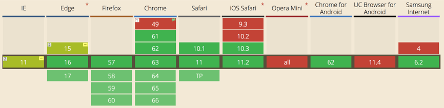
You may be wondering about using a polyfill, but a polyfill to cover everything CSS Grid does would be heavy. You’re better off writing your fallback CSS then wrapping your CSS Grid overrides in @supports ( display: grid; ) {}.
This works great because all of the browsers that support grid also support the @supports statement.
Getting to Know CSS Grid Terminology
Before we get started with CSS Grid we’ll need to cover some of the basic terminology of Grid.
CSS Grid Basics
grid container – The grid container is the parent of all grid items. It is declared with the display: grid; rule. This will go on the element wrapping your grid items and define the columns and rows.
.grid-container {
	display: grid;
}
grid item – The items that are direct children of the grid container. These are the elements that will be placed on the columns and rows of our grid.
<div class="grid-container">
	<div class="item-a"></div>
	<div class="item-b"></div>
	<div class="item-c"></div>
	<div class="item-d"></div>
</div>
grid lines – The lines that divide the columns and rows of the grid. These are numbered starting with 1. There will always be 1 more grid line than the number of columns and rows respectively.
grid track – The space between 2 adjacent grid lines. Essentially your columns and rows.
grid cell – The space between 2 adjacent grid column lines and 2 adjacent grid row lines.

grid area – The space between any 4 grid lines. It can cover any number of rows and columns.
Defining the Grid
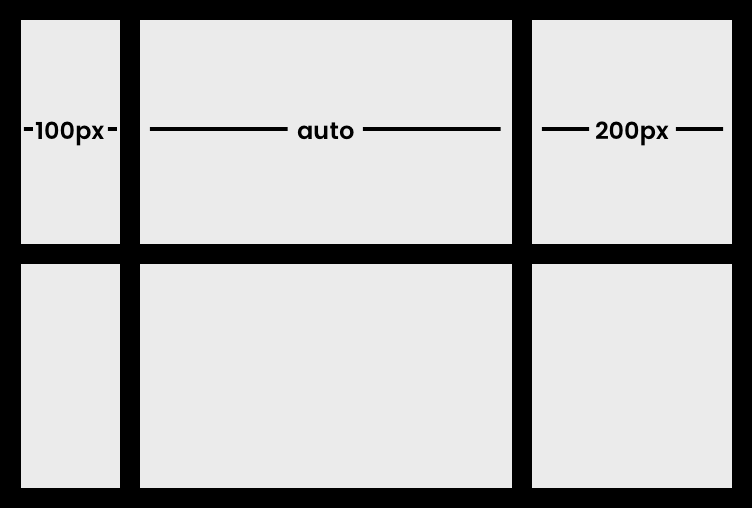
grid-template-columns – Defines the width and number of columns in the grid.
.grid-container {
	display: grid;
	grid-template-columns: 100px auto 200px;
}
The code above will give our grid 3 columns with the first column being 100px wide and the third being 200px. While the second column will automatically use the rest of the space. Alternatively we could use the new fr unit to set the second column to 1fr meaning it would use the remaining free space of the grid. This can work better than auto in some instances.
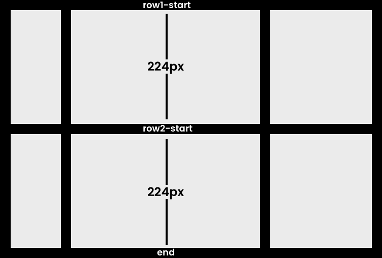
grid-template-rows – Defines the height and number of rows in the grid.
.grid-container {
	display: grid;
	grid-template-columns: 100px auto 200px;
	grid-template-rows: [row1-start] 224px [row2-start] 224px [end];
}
Setting rows is the same as columns. The example above just included some names for our rows. But this can be applied to columns as well. Using [grid-line-name] syntax in our declaration allows us to name each line on our grid. This can be useful for placing items on the grid later.
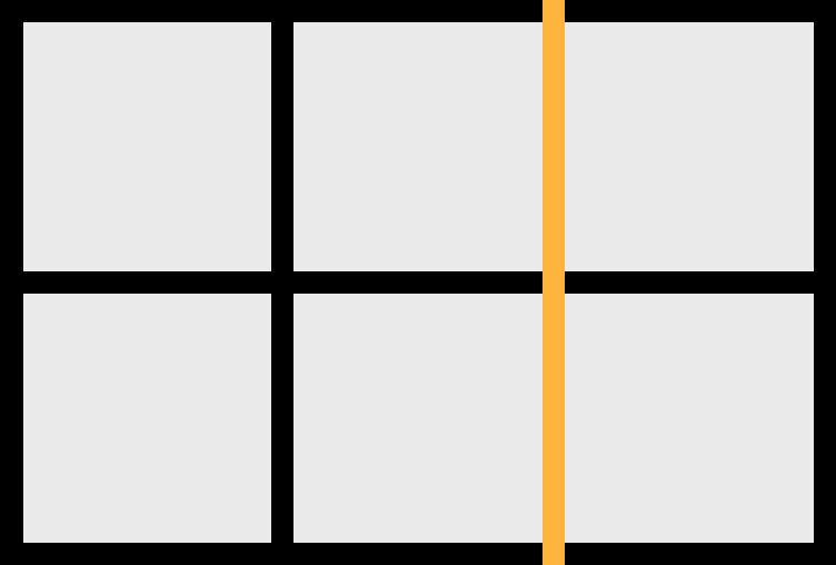
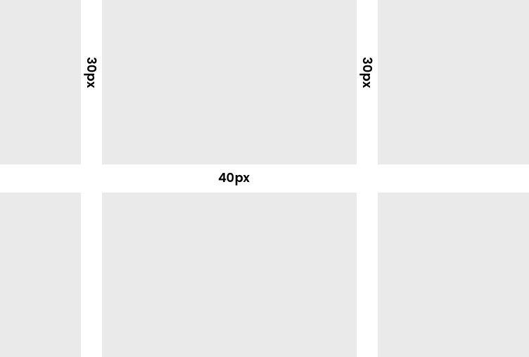
grid-gap – Grid gap is the shorthand that let’s us set the spacing between rows and columns. Your first number is your row gap and your second will be your column gap. Note: The gap is only between rows and columns. Not outside.
.grid-container {
	display: grid;
	grid-template-columns: 100px auto 200px;
	grid-template-rows: [row1-start] 224px [row2-start] 224px [end];
	grid-gap: 40px 30px;
}
I’ve removed the black borders from the previous grid examples to show what our final grid will look like.
Grid Template Areas
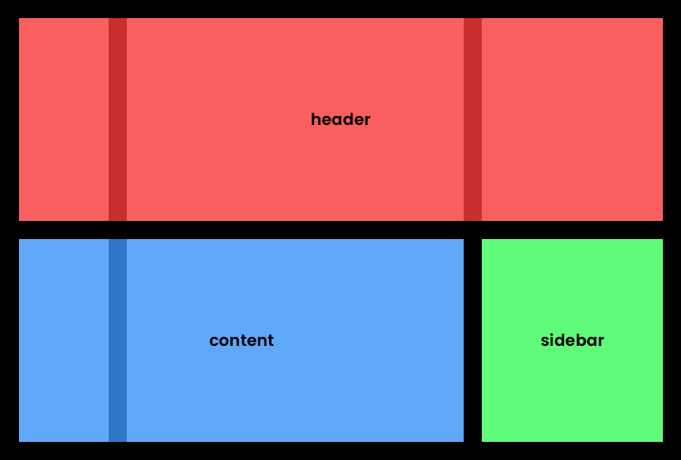
One of the more powerful features of CSS Grid is the ability to name name grid areas. Making it extremely easy to place items in those areas as well as reorganize content at different breakpoints.
For example, we could take our above grid and define the first row as the header. The first two columns in the second row as the content. And the third column in the second row as the sidebar.
That’s done like so:
.grid-container {
	display: grid;
	grid-template-columns: 100px auto 200px;
	grid-template-rows: [row1-start] 224px [row2-start] 224px [end];
	grid-gap: 40px 30px;
	grid-template-areas:
		"header header header"
		"content content sidebar";
}
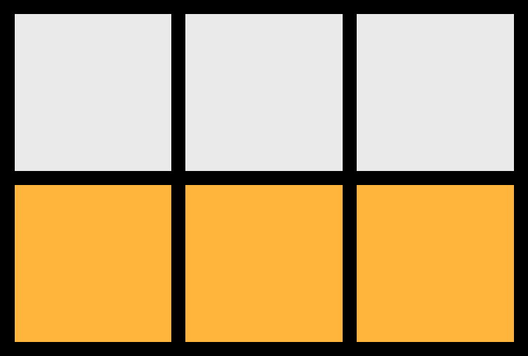
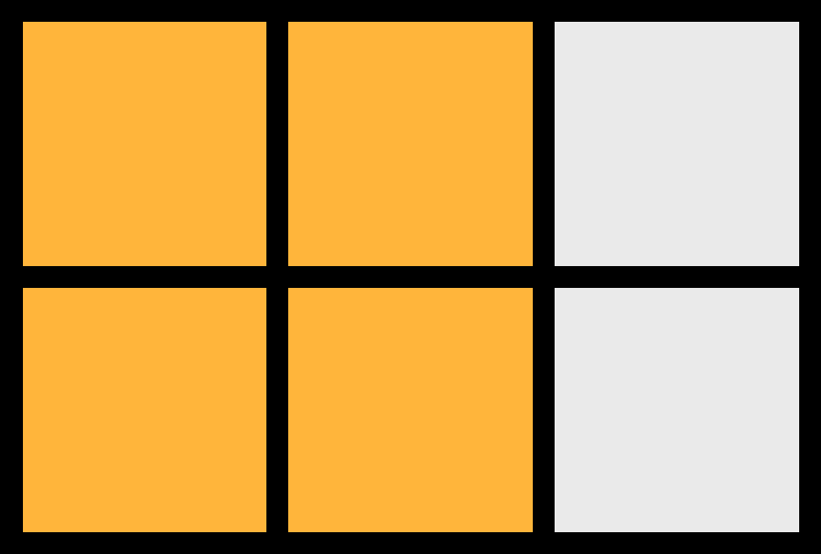
Placing Items
Placing items on your CSS Grid is easy. You simply define what grid line you want the element to start at and which grid line to end on. To do this you can use grid-column-start / grid-row-start and grid-column-end / grid-row-end. Or to make things simple we can use the shorthand of grid-column: <grid-column-start> / <grid-column-end>; and grid-row: <grid-row-start> / <grid-row-end>;.
Let’s place a few items on our grid.
.item-a {
	grid-column: 2 / 4;
	grid-row: 1 / 2;
}

.item-b {
	grid-column: 1 / 2;
	grid-row: 1 / 3;
}

.item-c {
	grid-column: 2 / 4;
	grid-row: 2 / 3;
}
Here’s what that will look like with some colors added to make it easier to see.
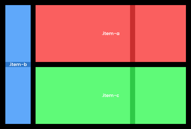
You’ll see .item-a starts at grid column line 2 and ends at grid column line 4. Then covers grid row line 1 to grid row line 2.
.item-b goes from grid column line 1 to grid column line 2. Then starts at grid row line 1 and goes to grid row line 3.
.item-c starts at grid column line 2 and ends at grid column line 4. And covers grid row line 2 to grid row line 3.
Bonus CSS Grid Tips
A few bonus tips to continue your journey into CSS Grid.
Fractional (FR) units
Grid comes with the fr unit. Which uses a fraction of the remaining free space in the grid.
Using grid-template-columns: 1fr 50px 1fr 1fr; would create 4 rows. With one defined specifically to 50px and the other 3 using up even portions of the remaining free space. If our grid is 650px wide this would give us a grid with column 1 being 200px, column 2 being 50px, column 3 being 200px, and column 4 being 200px.
If we switch that rule up to grid-template-columns: 1fr 50px 1fr 2fr; the last column will use twice as much of the free space. With our 650px grid we’d have column 1 being 150px, column 2 being 50px, column 3 being 150px, and column 4 being 300px.
repeat() function
Writing out all of these columns individually is easy if we’re only working with a few columns, but no one wants to write the same rule out 12 times. Enter the repeat() function. It allows us to repeat any rule a user defined number of times.
grid-template-columns: repeat(12, 1fr); would create 12 columns each using an equal amount of the total grid width.
Negative grid lines
Using negative grid lines can be helpful for placing items from the right side of the grid. Or to easily make sure an element spans the full grid even if a column were to be added in the future. Using grid-column: 1 / -1; would make our element span the entire grid-columns width.
Learning More
If you’ve made it this far you’ve just dipped your toe into CSS Grid. There are a ton of exception resources out there for Grid, and more are being added everyday.
I can’t recommend Wes Bos’s CSS Grid course enough. He does a great job of digging into the basics and terminology behind CSS Grid and also takes you through the some real world examples.
Here are a few additional resources that I’ve used putting this post together and playing with CSS Grid myself.
- A Complete Guide to Grid | CSS-Tricks
- A Book Apart, Get Ready for CSS Grid Layout
- 11 Things I Learned Reading the CSS Grid Specification
- How to recreate Medium’s article layout with CSS Grid
- CSS Grid Layout Module Level 1