If you browse any kind of newer web designs you’ve surely seen that full-width background images with text layered on top are all the rage.
There are several considerations to keep in mind when using these types of design elements.
Performance Considerations
Large, photographic background images tend to be a much larger file size. Consider if the stock photograph of a laptop in a coffee shop is really adding to the message. (Hint: It’s probably not.) Think of simplifying the imagery used.
- Consider using simple images with just a few colors. Photographs tend to be distracting.
- Patterns can be used to create a unique look with smaller file sizes.
- Ask yourself if the stock photography background is really worth another 150+kb of page load.
Accessibility Considerations
Text on a photograph is often hard to read. And even though you may crop the image to make the text over dark areas at the ideal size, we live on a responsive web. There will likely be some point where the text overlaps a light portion of the image. Not to mention too much going on in a photograph can distract from the main call to action. Typically in the text.
- Use overlays on top of the image to make text more readable over top.
- Use different image crops at different breakpoints
Drawbacks of background-image
One way to accomplish this layout is using a CSS background-image rule to place the image on the main div. Then use padding to add space around the text.
You can have some simple markup with this method.
<div style="background-image: url('https://via.placeholder.com/728x90.png');">
    <h1>A Title</h1>
</div>
That’s nice but there are a few drawbacks to this method.
You can’t easily serve different resolution images based on the browser size1. That means the retina desktop version of your site is loading the same image as the non-retina mobile version.
The image also isn’t accessible. You have no way of adding an alt tag to the image to help screen readers describe the image to visually impaired users.
Taking a look at that method with an image grabbed from Unsplash and scaled to 1800px wide gives a 227kb image. That’s the same image used on desktop and mobile with this method.
Side note: You should definitely optimize any images used on your site through tools like Smush, Imagify, or ImageOptim. 227kb is needlessly large, especially when just a random background image.
Using responsive images with object-fit
One very useful feature of the functions for outputting images in WordPress is that you can easily generate responsive <img> elements. This takes various image sizes WordPress creates of images on uploads and serves them up at the proper screen size.
So if you upload an 1800px wide image and the user’s browser is only 1024px wide it will instead pull in the 1024px crop of the image. Saving your user precious bandwidth.
Trying to get an image to scale to properly fill an unknown space is difficult at best and unsupported at worst.
Enter object-fit. This CSS property gives us the ability to control how an <img> element is resized to fill its container. And we can use it very similarly to the background-size: cover; property.
This also allows us to take advantage of the srcset attribute to serve different image sizes at different screen widths.
<div class="entry-header">
    <figure class="object-fit-thumb">
        <?php the_post_thumbnail(); ?>
    </figure>
    <h1 class="entry-title">Spiffy Title</h1>
</div>
In that example, I’m using WordPress built in the_post_thumbnail() function which will output a responsive version of the featured image. Responsive image markup may look something like this:
<img src="small.jpg"
     srcset="large.jpg 1024w, medium.jpg 640w, small.jpg 320w"
     sizes="(min-width: 36em) 33.3vw, 100vw"
     alt="A rad wolf">
With that markup in place our CSS styles could look like:
.entry-header {
overflow: hidden;
position: relative;
}
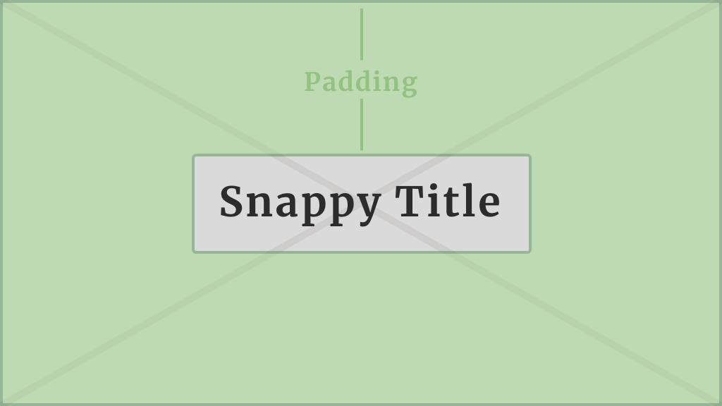
.entry-title {
padding: 200px 20px;
position: relative;
text-align: center;
z-index: 2;
}
.object-fit-thumb img {
width: 100%;
height: 100%;
object-fit: cover;
position: absolute;
z-index: 1;
}There is quite a bit going on here so let’s break it down.
First up is our .entry-header class that wraps everything. We’re setting this to position: relative; so when we absolutely position our image it will be relative to the .entry-header div. Then we’re setting overflow: hidden; so when our image grows to cover the area it doesn’t show portions that extend outside the edges of .entry-header.
Next, is our .entry-title element. Not much happening here except we’re adding a good amount of padding which will help control the height of the section. Then z-index: 2; which is important to make sure our text shows on top of the image. And position: relative; which makes sure our z-index works.
Lastly, we’re targeting the <img> element within our .object-fit-thumb element to make sure it is position: absolute; and that it expands 100% of the height and width of the main .entry-header div. The object-fit: cover rule tells the image to resize to cover the element rather than distort to fit the dimensions specifically. And finally z-index: 1; makes sure our image shows below the .entry-title that had a higher z-index.
Now taking advantage of WordPress responsive image sizes our 227kb image loads a considerably smaller 62.5kb version on mobile. That’s a lot of extra data.
Browser Support
While it does have pretty good support across modern browsers, object-fit, like everything else, is held in check by how much you need to support IE. Luckily there are polyfills that work pretty well, and below I have a progressive enhancement version that fallsback to a workable solution if the browser doesn’t support object-fit or @supports.
.object-fit-thumb img {
    width: auto;
    height: auto;
    max-width: 1000%;
    min-height: 100%;
    min-width: 100vw;
    position: absolute;
    top: 50%;
    left: 50%;
    transform: translateX(-50%) translateY(-50%);
    z-index: 1;
}

@supports ( object-fit: cover ) {
    .object-fit-thumb img {
        width: 100%;
        height: 100%;
        top: 0;
        left: 0;
        object-fit: cover;
        transform: none;
    }
}
Inside our @supports check we’re resetting some of the values we had to set to make the fallback work (e.g. top, left, width, height, and transform).
And calling the object-fit property.
- You could create separate CSS rules for the image used, but that’s not going to work great within a content management system.