Update: 4/11/2018
The launch of Gutenberg has been pushed back from the original early April date I had heard. I haven’t heard a new release date at this point. But I do have an updated method for adding the new alignfull and alignwide alignment options. They’re also available for use in more blocks now too!
The new Gutenberg editor is quickly approaching. For those of you that don’t know Gutenberg will be shipping with WordPress 5.0. Which is currently aimed for an April release date.
That leaves only a few months to get your plugins and themes ready once Gutenberg is live. Luckily a lot of it will be handled out of the box with posts being automatically ported to the Gutenberg editor.
But a few features will require some modifications to your theme to add support. One of those is the new wide and full size image alignments.
Declaring Theme Support
Adding support for the new image alignments is easy. You just need to add the add_theme_support( 'align-wide' ); function into the after_setup_theme action. If all that is nothing but gobbildy gook to you the following snippet inside your functions.php should do the trick. Just make sure to replace my_theme with a prefix unique to your theme.
function my_theme_setup() {
	// Add support for wide images
	add_theme_support( 'align-wide' );
}
add_action( 'after_setup_theme', 'my_theme_setup' );
Styling the Output
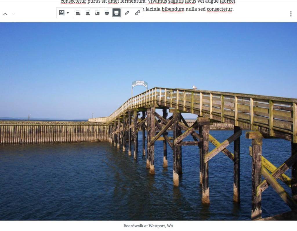
WordPress outputs two new classes on the figure element markup to handle these new alignments: alignwide and alignfull.
The actual markup output will look similar to this.
<figure class="wp-block-image alignwide">
<img src="https://mydomain.com/wp-content/uploads/image.png" alt="">
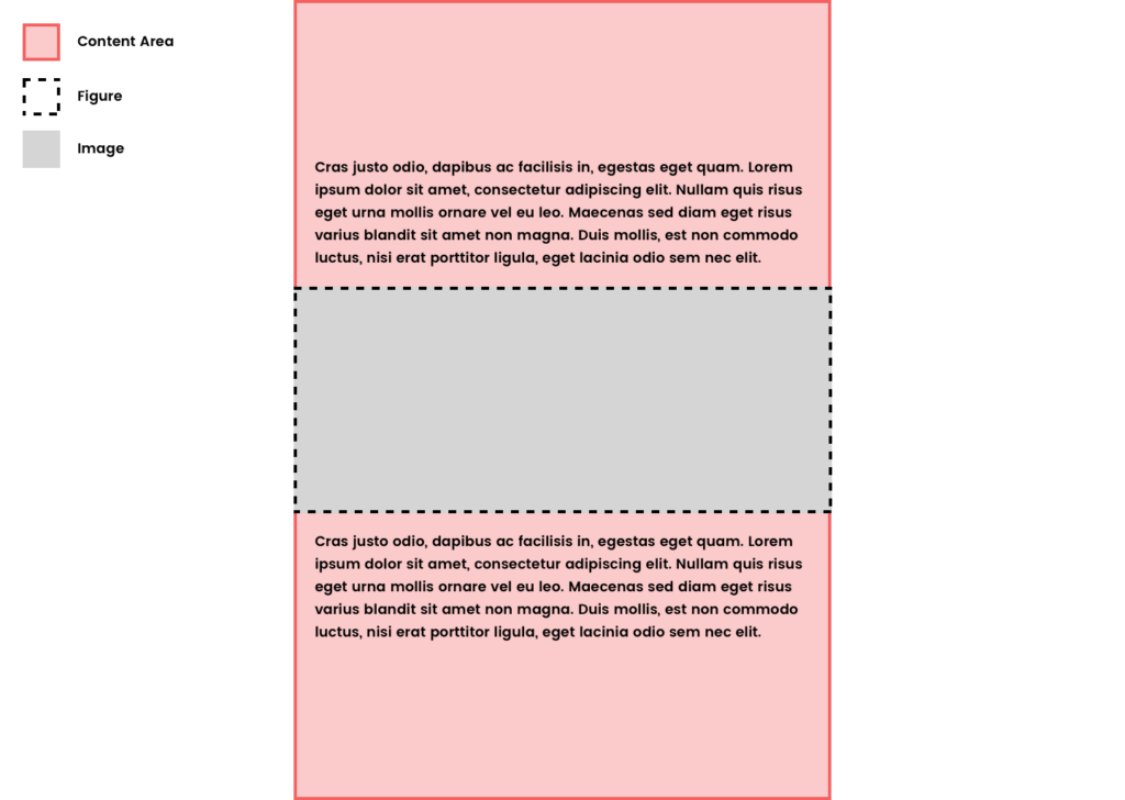
</figure>Now before proceeding I should note that these image sizes are going to work best on post layouts that don’t have sidebars. Like the layout you’re currently reading. The Authority theme displays posts (on desktop) in a content area centered on the page with a max-width: 688px set.
If you’re on a mobile device you’re not going to have as much space. So here’s a diagram.
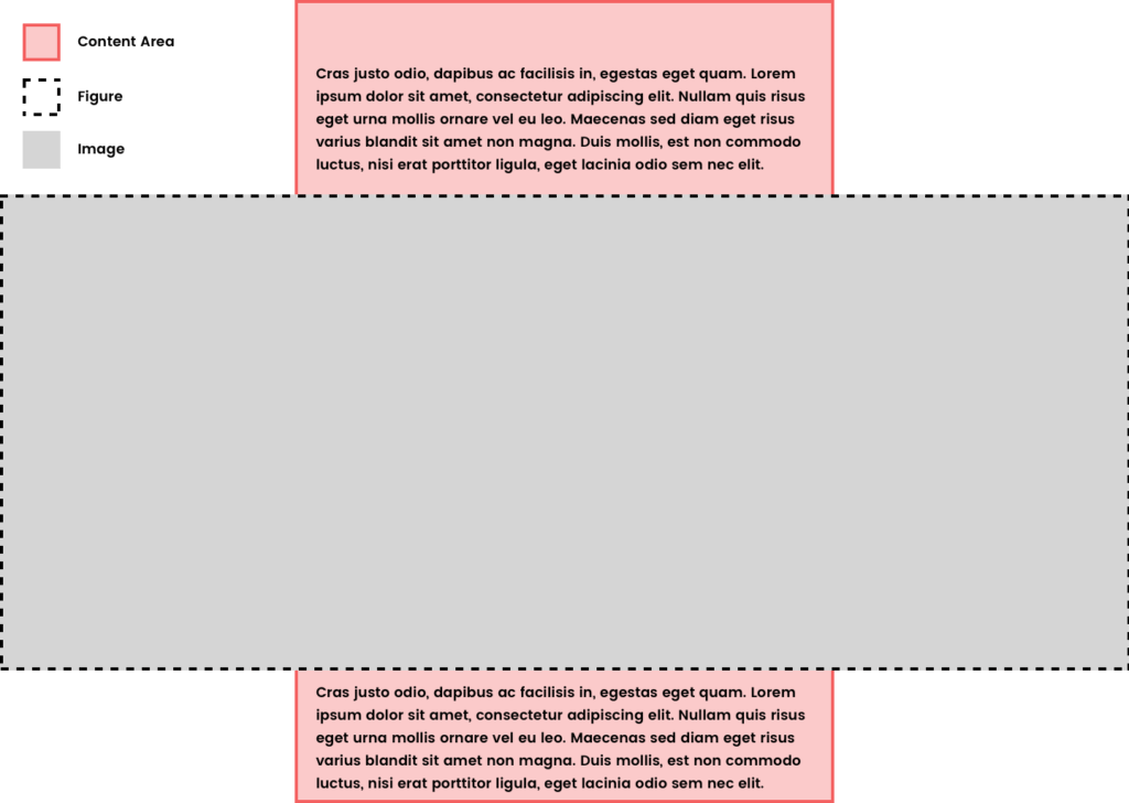
.alignfull
So for our alignfull image we want to break out of the content area’s width. We can do that by setting the width of the alignfull element to be 100vw or 100% of the viewport width. Then using positioning and negative margins to center it.
.alignfull {
	width: 100vw;
	position: relative;
	left: 50%;
	right: 50%;
	margin-left: -50vw;
	margin-right: -50vw;
	text-align: center;
}

.alignfull img {
	width: 100%;
}
I’m then setting the img element in the figure to grow to 100% of the figure size regardless of the size of the image. This could cause loss in quality for smaller images so use as you like.
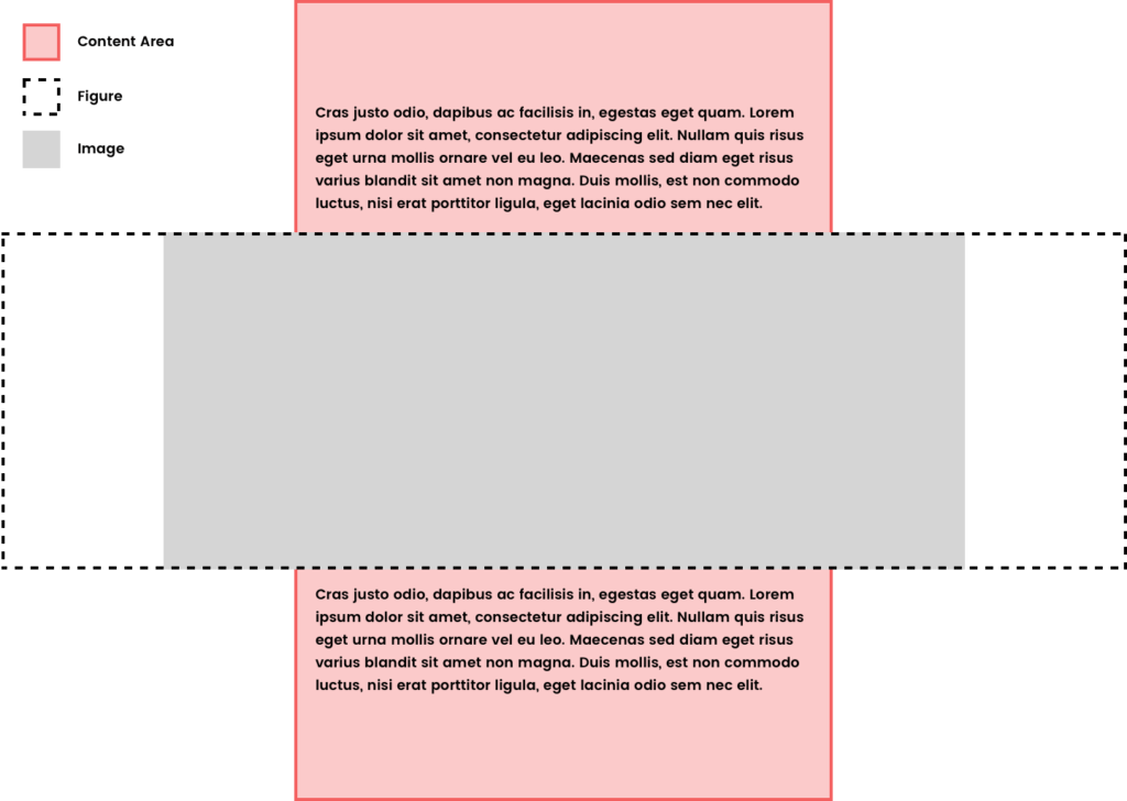
.alignwide
On our alignwide image we just want to break out of the content container slightly. We can handle this similarly with the figure element by making it take up the full 100vw then setting the img inside to have a max-width.
.alignwide {
	width: 100vw;
	position: relative;
	left: 50%;
	right: 50%;
	margin-left: -50vw;
	margin-right: -50vw;
	text-align: center;
}

.alignwide img {
	max-width: 1024px;
}
So now our alignwide figure element will expand 100vw. But our img element inside will have a max-width of 1024px. Allowing it to break out of the content container, but not expand fully to the edges until we get to a smaller screen size. Feel free to use whatever max-width best suits your design.
Another Method
The Gutenberg Starter Theme handles the wide and full alignments a little differently.
In the case of this theme the content area isn’t constrained by a max-width. Instead everything within the .entry-content section is getting a max-width set. The rule used to match our content area above then would be:
.entry-content > * {
     margin: 1.5em auto;
     max-width: 688px;
}
This takes every direct child element on the .entry-content element and gives it a max-width and top and bottom margin of 1.5em. With an automatic left and right margin to center it.
Then for alignfull they simply overwrite that rule with:
.entry-content > .alignfull {
     max-width: 100%;
}
This makes anything with the .alignfull class expand to 100% the width of the page.
And the alignwide rule becomes:
.entry-content > .alignwide {
     max-width: 1024px;
}
This method does have its issues when dealing with cover image and pullquote left and right alignments. Oliver Juhas has a nice little PHP function for adding a wrapper element in these cases that can help style these elements.
Either way should work it depends on the structure of the theme you’re working with in the beginning.
Wrapping Up
Getting your theme ready for the new image alignments coming along with Gutenberg in WordPress 5.0 is the starting point. If you’ve got another suggestion for handling these new image alignments I’d love to hear it in the comments. There’s no one way to style a website.