- Getting Started
- Installing Demo Data
- Recommended Plugins
- Setting Up Jetpack
- Setting Up WooCommerce
- Customizing the Homepage
- Customizing Homepage Sections
- Customizer Settings
- Adding Menus
- Widgets and Sidebars
- Post Formats for Galleries and Videos
- Page & Post Templates
- Adding subtitles with the excerpt
- Featuring a Product on the Shop page
- Adding a Sticky Post to the Blog
- Setting up Author Information
- Useful Resources
- Hosting
- Hooks
Getting Started
Upon activating the Aurora theme you will be directed to the Getting Started section for the WordPress admin screen. From here you can read through the help file, install recommended plugins, check the FAQs, and activate your theme’s license to enable updates.
It is strongly recommended that you activate your theme license for updates. If you purchased the theme on Creative Market, ThemeForest, or another third-party service please contact me with your name, email, and purchase number.
You can return to the Getting Started section at anytime from the Appearance > Getting Started menu in the dashboard.
Installing Demo Data
When first activating Aurora your site will be a basic blog using your existing post data. If you would like to hit the ground running you can import the demo site data to set up your site with the information from the Aurora demo.
To import demo data for products you’ll want to have WooCommerce installed. For projects and testimonials you’ll want Jetpack and you’ll need to have them activated to work properly.
It is strongly recommended to install the Advanced Custom Fields plugin as it allows for additional information to be added to each post.
You can find the demo import data within the assets folder of the theme. Or download it here. Then you can import this into WordPress from Tools > Import. If you haven’t activated the WordPress installer before you’ll be able to do so from this menu.
Notes on installing demo data
- You’ll need to install required plugins first or the data for those items will not import properly.
- If you have already installed WoocCommerce you might end up with duplicate Shop, Cart, Checkout, and My Account pages. To match the theme demo you’ll need to set those imported from the data as the pages to use within WooCommerce
- You will have to add widgets and menus on your own.
- You will have to customize the homepage sections on your own. Custumizer settings are not saved in the WordPress export.
Recommended Plugins
The following plugins are recommended to get the most features out of your theme. Any of these plugins can be installed from the Plugin tab on the Getting Started page of your theme.
Advanced Custom Fields
This plugin is used to add additional vertical image uploads for better integration with featured post areas. It is also needed to allow heroes to be used on individual pages. As well as setting name and sub-name for testimonial authors.
Jetpack
Jetpack is a free WordPress plugin with a ton of features. Aurora makes specific use of the Portfolio, Testimonial, Tiled Gallery, and Infinite Scrolling features.
WooCommerce
WooCommerce is an ecommerce platform for WordPress that let’s you sell digital and physical goods. Aurora makes use of WooCommerce for the shop portion of the site.
Shortcodes Ultimate
This plugin allows for a variety of shortcodes that can be used within the content editor to easily add tabs, sliders, columns, and more.
WPForms
This plugin can be used to easily create forms for your WordPress site using a drag and drop editor.
Setting Up Jetpack
After installing and activating the Jetpack plugin you’ll be asked to connect to a WordPress.com account to enable the Jetpack features. Upon doing so you’ll need to enable the individual features you’d like to use. Aurora is tuned to use the following items:
- Testimonials and Portfolios can be individually activated under the Writing section within the Custom content types meta box.
- Infinite Scrolling can be turned on under the Writing section within the Theme enhancements meta box.
- Tiled galleries can be activated by turning on the Speed up images and photos setting in the Media metabox. This also offloads images to the WordPress.com servers which can speed up your site. Alternatively Tiled galleries can be turned on individually by going to yourdomain.com/wp-admin/admin.php?page=jetpack_modules.
There are many additional feature within Jetpack that can be used to improve social sharing, related posts, stats, and more.
Setting Up WooCommerce
Aurora supports the WooCommerce plugin that allows you to easily sell digital and physical goods from your WordPress site.
After installing and activating the plugin WooCommerce will walk you through a guide to set up your store and create your first products.
Note: While not required it is recommended to use the Full Width page template for the Cart and Checkout pages.
Aurora does support widgets for the Shop page on your site. To learn more about adding widgets check the Widgets section of this guide.
For more information on WooCommerce check out their extremely useful documentation.
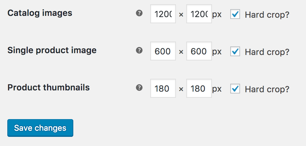
WooCommerce Image Sizes
If you had not previously had WooCommerce activated before activating Aurora you will need to update the catalog image size to 1200px x 1200px yourself.
To do this Navigate to WooCommerce > Settings > Products > Display and at the bottom of the page you will see a section for Product Images. Update the Catalog images settings to 1200 and 1200 to get the best image quality within Aurora.
Customizing the Homepage
Aurora allows for customization including up to 7 sections on the homepage as well as a featured space and callout section.
Creating the Homepage
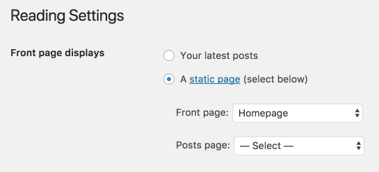
First, you’ll need to create the a Page for the homepage by going to Pages > Add New.
Next, you’ll need to set this as your Static Front page. This can be done from the Settings > Reading menu.
Now you can go into the Customizer from Appereance > Customize and begin editing your Theme Options.
To set the title and subtitle shown on the homepage from within the Customizer go to Theme Options > Front Page Hero. Here you can set the title, subtitle, as well as a button and link. Alternatively each item can be reached by clicking the pencil icon next to the element.
Customizing callout and featured section links
You can add a featured item to the front page from the Theme Options > Front Page Feature panel. Here you can set a title, copy, image, button, and link for the feature section. To further customize the link you can use the see the Hooks Section.
Likewise you can add a callout bar under the feature section from Theme Options > Front Page Callout which allows for copy and a button. To further customize the link you can use the see the Hooks Section.

Customizing Homepage Sections
To set the individual sections on the homepage you will navigate to the Theme Options > Front Page Sections panel.
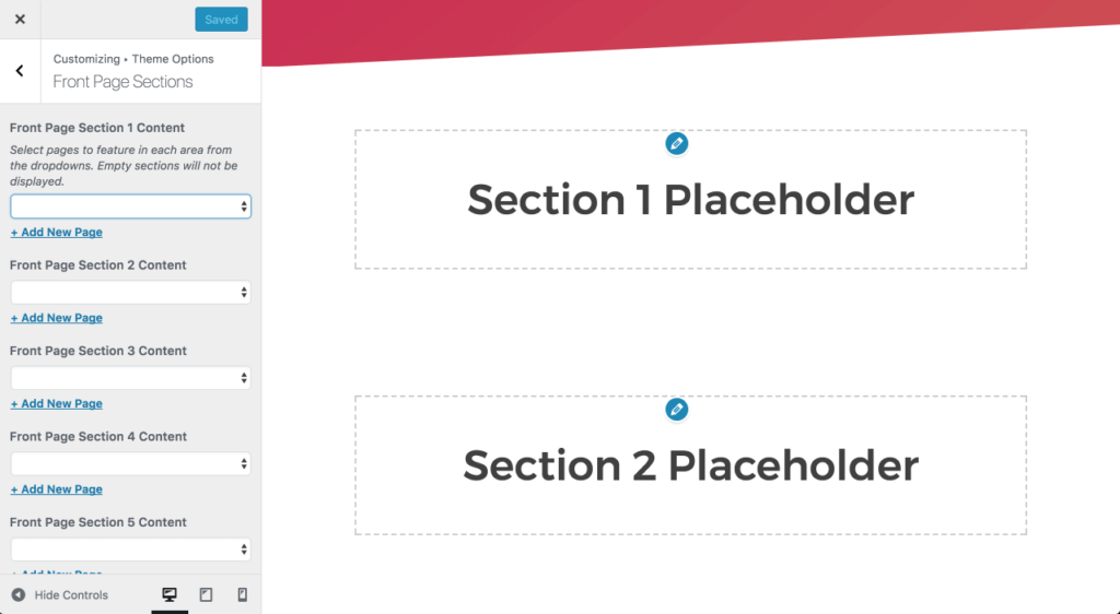
From here you can select what content to display in each individual section. By selecting pages making use of the various Page templates you can take advantage of the content that template displays.
For example, to show your Blog posts you would select either the page set to your Posts page within the Settings > Reading settings or select a page using the Blog page template.
Page templates can be used with the front page sections to display Posts, Testimonials, Portfolios, Products, Features, and page content.
Each template (excluding those using the default, full width, builder, and sidebar) will pull in the page title and the page excerpt. The remaining templates will only pull in the page content.
Customizer Settings
Aurora gives you options for customizing your theme from the Apperance > Customize screen. Within the Customizer you will see a variety of options known as panels.
Theme Options > Front Page Hero
- Front Page Title – The
h1element for the front page within the hero section. - Front Page Description – The subtitle for the front page hero.
- Button Text – An optional text field for adding a button to the hero. Must be set for the button to display.
- Button URL – The link for the button. Must be set for the button to display.
Theme Options > Front Page Featured
- Show Featured Section – Show or hide the front page featured section.
- Featured Title – Add a title to the featured section.
- Featured Copy – Copy to appear below the title.
- Featured Section Image – Set an image for the featured section. Recommended size is 725 px x 1100 px.
- Button Text – An optional text field for adding a button. Must be set for the button to display.
- Button URL – The link for the button. Must be set for the button to display.
Theme Options > Front Page Callout
- Show Callout Section – Show or hide the front page callout section.
- Callout Text – Text to display for the callout.
- Button Text – An optional text field for adding a button. Must be set for the button to display.
- Button URL – The link for the button. Must be set for the button to display.
Theme Options > Front Page Sections
- Front Page Sections – Select pages to feature in each of the 7 available front page sections. Checkout the homepage section for more information.
- Number of portfolio items to show – Set the number of Portfolio items to show when using the Portfolio page template on the homepage.
- Number of testimonial items to show – Set the number of Testimonial items to show when using the Testimonial page template on the homepage.
- Number of blog posts to show – Set the number of blog posts to show when using the Blog page template or the Page for Posts on the homepage.
- Number of features to show – Set the number of Features to show when using the Features page template on the homepage.
- Number of products to show – Set the number of Products to show when using the Products page template or the WooCommerce Shop page on the homepage.
Site Identity
- Logo – Upload your logo image.
- Site Title – Set the title for your site.
- Tagline – Set a tagline for your site.
- Display title and tagline – Select whether to show or hide the site title and tagline.
- Site Icon – Set an image to use as your site icon for use on phones and within browsers.
Colors
- Gradient – Aurora makes use of gradients in several locations on the site. It is recommended to use the
background-colorandbackground-imageCSS rules to create gradients. Sites like Grabient make it easy to get the CSS to use. Simply visit the site and click to Copy the CSS of a gradient you like and paste the results in the text area. - Primary Color – Set the primary color for the site. This is used for buttons, links, and more.
- Footer Background Color – Set the background color of the footer.
- Background Color – Set the site background color.
Header Image
- Current Header – Select an image to use in the header. This will place the image over top of the gradient background.
- Header Image Opacity – Control the opacity of the header image. This allows you to show the gradient through the image.
Background Image
Background Image – Set a background image for the site.
Menus
Control your menus directly from the customizer. See the menus section for more information.
Content Options
Post Details – Control whether to display the date, categories, tags, author, and comment link on posts. This section requires Jetpack to be installed.
Widgets
Control your widgets and sidebars form the customizer. See the widgets section for more information.
Static Front Page
Select your Static Front Page and Page for Posts. These are the same options from the Settings > Reading screen.
Additional CSS
Add custom CSS rules to your theme.
Adding Menus
Aurora makes it easy to create menus on desktop and mobile. As well as integrating with Font Awesome for easily adding social icons. Menus can be created from the Appearance > Menus section or within the Customizer Menus panel.
Menu Locations
- Primary – The main menu location that appears on desktop browsers at the top of the page.
- Mobile – The mobile menu that appears below 960px wide screens and comes in from the side when a menu button is clicked. Feel free to set this to the same menu as the Primary location or a custom mobile only menu.
- Footer – The footer location appears in the bottom right corner of the site and is a great place to include social links.
Add a Callout Button to the main menu
Add the class nv-callout to menu items to create a callout style that draws attention to that specific button.
Add the Search Button to the main menu
Add class js-open-site-search to menu items to have the button fire JavaScript to display the site search dropdown.
Add Links with no underline to the main menu
Add class nv-no-underline to menu items if you’d like to remove the hover underline on certain links.
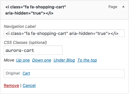
Adding Font Awesome icons
Aurora comes with Font Aweomse installed. That means you can easily add icons to any menu items by navigating to Font Awesome selecting an icon, and copying the <i> element codes that looks like <i class="fa fa-bath" aria-hidden="true"></i>.
Then simply paste that into the Navigation Label field and save your menu.
Widgets and Sidebars
Aurora makes use of several widgetized areas for adding functionality to your site.
Sidebar
Adding widgets to this area will display on pages using the Sidebar page template.
Footer Columns
Aurora has 4 footer columns that can be used to add widgets across the footer. Consider using this for things like menus, Facebook widgets, Twitter, widgets and more.
WooCommerce Shop Archive Sidebar
Aurora also features an optional widget area on the page set to the Shop page within WooCommerce. This area requires WooCommerce to be installed for use.
Post Formats for Galleries and Videos
Aurora allows for gallery and video post formats in addition to the standard post format. The main difference being that the gallery and video formats will replace the featured image with the first gallery or video added into the post content.
Create a video post format
- Go to Posts > Add New to create a new post. In the Format Window select Video.
- Now add a video to your WordPress post using the WordPress oembed features. Full list of oembed sources.
- Save or preview the post to see the video post format in action.
Create a gallery post format
- Go to Posts > Add New to create a new post. In the Format Window select Gallery.
- Add a gallery within the content editor by selecting Add Image and Create Gallery. Set up your gallery and select the gallery Type. It is strongly recommended you use Jetpack’s tiled galleries for this feature. As they have much nicer styling than standard galleries.
- Save or preview the post to see the gallery post format in action.
Page & Post Templates
Aurora comes stocked with several page templates to give you the flexibility you need to create a great site.
Page & Post Templates
Default Template – The default page template is similar to the post single template. It features the title, subtitle, and content centered on the page with the content narrowed to increase readability.
Sidebar – The sidebar template is the same as the default page, but moves the content to the left and includes a sidebar on the right.
Full Width – The full width template is the same as the default template, but with the content stretched to go the full width of the site container.
Builder – The builder template is intended to be used with page builders such as Divi or Beaver Builder. It features the header, footer and pulls in the post content with no margins or padding.
Page Templates Only
Homepage – The homepage template can be used to set up a custom front page for the site. This template gives control of several sections within the customizer to pull in data from other pages.
Blog – The blog template can be used to pull in posts on a page. It functions the same way a page would if set to be the Page for Posts.
Portfolio – The portfolio template pulls in Jetpack’s Portfolio posts. This requires the Jetpack plugin is activated with the Portfolio content type turned on.
Testimonials – The testimonials template pulls in Jetpack’s Testimonial posts. This requires the Jetpack plugin is activated with the Testimonials content type turned on.
Features– The features template pulls in any child pages as well as their featured image and content in a grid of 3 columns.
Including heroes on pages
You can choose to include the gradient hero on any page by checking the Include Hero metabox. This also gives you options to set an optional call to action button and link within the page hero. If left unchecked the page title and excerpt will appear centered on the page in the white space.
Adding subtitles with the excerpt
Pages and Posts allow for a subtitle to appear under the post title. This can be controlled by adding a custom excerpt to the post or page.
The excerpt also will pull into the front page sections for many of the page templates.
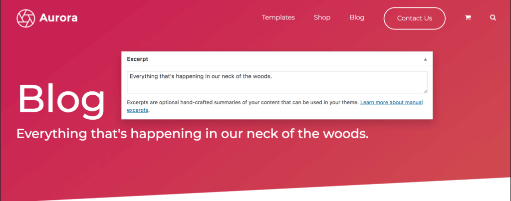
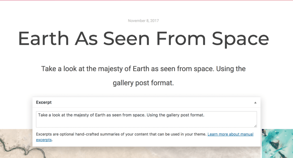
If you don’t see the excerpt box, make sure it is checked within the Screen Options panel at the top of the post edit screen.
Featuring a Product on the Shop page
To feature a product on the Shop page simple add a “featured” tag to the product you would like displayed in the featured space. If you have multiple products tagged with featured it will only display the most recently published product.
Adding a Sticky Post to the Blog
To call attention to a specific post on the blog you can set it as a sticky post. This will stick the post to the top of your post page and style it distinctively. Sticky blog posts are styled like the featured product above.
Setting up Author Information
Aurora displays post author information by default on single posts. It pulls in 3 fields: the author’s gravatar image tied to their email, their display name publicly field, and their nickname.

Useful Resources
Aurora is better with high quality images. Luckily there are tons of great resources for beautiful free stock photography. Did I mention it’s free?
Finding photos and resources
Editing Photos
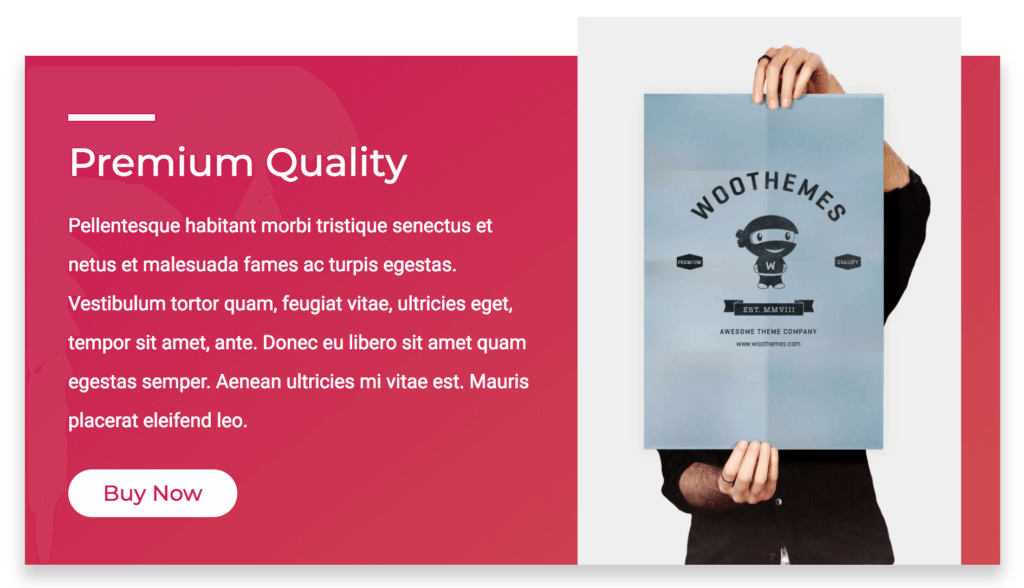
Mockups
- Poster Mockup – This template was used to create the demo post mockups under Our Work.
- AppLaunchpad Mockup Generator – Easily create device mockups
Hosting
Slow site? You may be in need of a hosting upgrade. These are some of my go-tos.
SiteGround – Quality WordPress hosting and support for a great price. This is what I used for hosting my own site.
WP Engine – A great managed WordPress hosting solution. I use this for client sites running just WordPress. Great security and tools specific to WordPress.
Hooks
Aurora has several hooks built in that can be used within child themes allowing you to expand on Aurora’s functionality.
Filters
aurora_copyright_info – Change up the copyright information that is put out in the footer
aurora_hero_cta_markup – Output custom link markup for the hero buttons. You’ll want to make sure the ara-button class is included to style the button properly. This filter is useful to integrate with Optin Monster’s Monster Links functionality.
aurora_callout_url – This allows you to add custom markup to the button on the callout section of the front page. Include the ara-button class to match the styles.
aurora_featured_url – This filter allows you to add custom markup to the button on the featured section of the front page. Include the ara-button class to match the styles.
aurora_featured_image – This filter allows to create custom markup in place of the <figure> element in the featured section of the front page.
aurora_button_string – This filter allows you to edit the text output on the buttons for Products and Projects on the homepage.
Actions
aurora_frontpage_featured – This action appears in the homepage below the hero and before the front page sections.
aurora_before_the_content – Runs before the post content is output on pages and posts.
aurora_after_the_content – Runs after the post content is output on pages and posts.
aurora_above_shop_sidebar – Runs before the shop sidebar is output.
aurora_below_shop_sidebar – Runs after the shop sidebar is output.
aurora_before_products – Runs before the products are output on the Shop page. It currently is used to display the featured post.
aurora_woocommerce_before_loop_end – This runs before the WooCommerce product loop ends.